Click

https://ift.tt/2KcaLPI
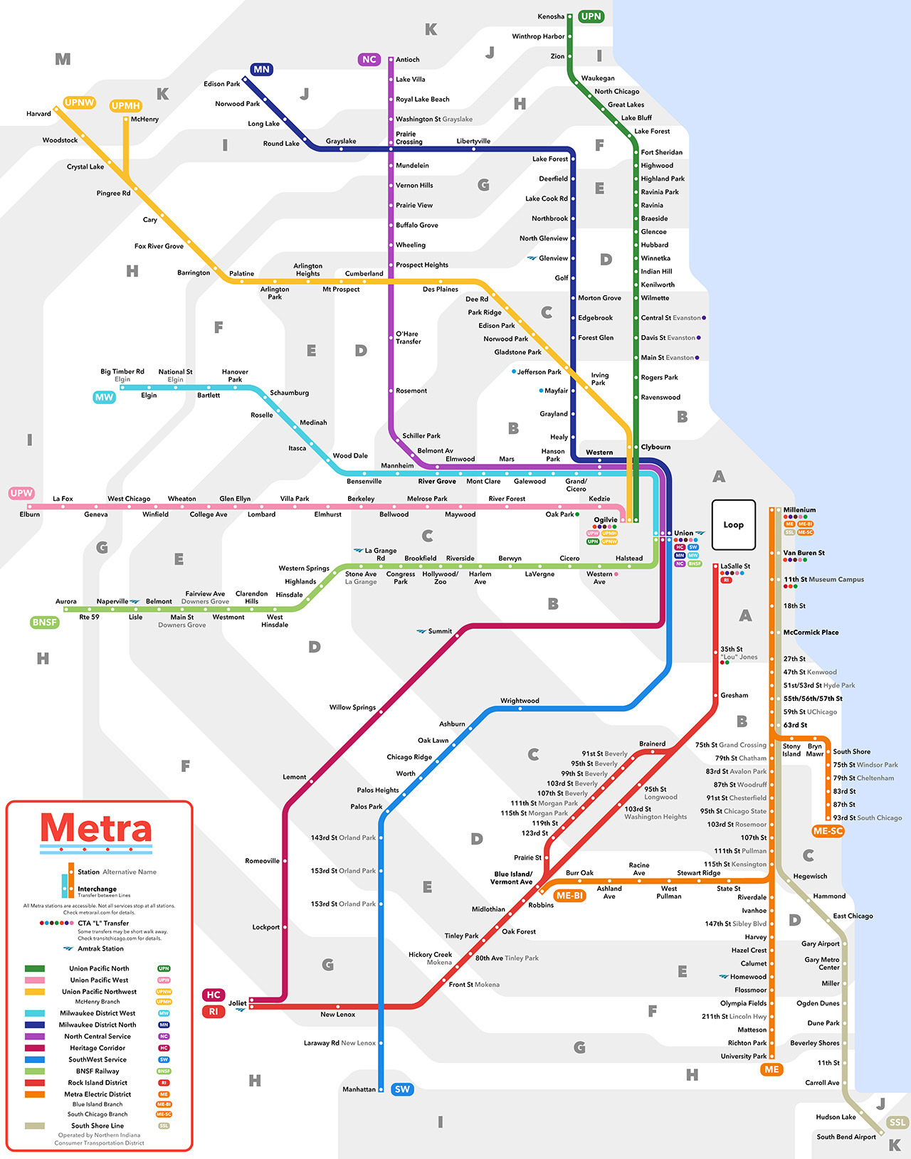
transitmaps: Submission - Unofficial Map: Metra Commuter Rail, Chicago by Rahul Raju Submitted by Rahul, who says: Hey! Wanted your comment on my redesign of the Metra map. Been a fan of the blog for a while, and I started making maps a few months ago. I would appreciate any feedback and comments. Transit Maps says: I like this a lot, Rahul! Very clean, slick and easy to follow. Pleasingly, the fare zones are clean and subtle – I note with some dismay that the Chicago RTA’s “Train Connections” map has added multi-coloured fare zones (PDF link). They still make some odd shapes here and there, but it’s not problem in my eyes. I think the inclusion of a defined Loop area is quite clever, as all the Metra terminal stations are placed in the correct positions relative to it (one small error here as “Millenium” station should be “Millennium”), though some people might think there should be more indication of integration between Metra and the “L” than the simple coloured disks that Rahul employs. Personally, I think his approach is fine – this map is unapologetically all about Metra, rather than being a full regional map like the RTA’s. It might be nice to note that the two Prairie Crossing stations (on the NC and MN branches) are actually a short walk from each other, but from an operational point of view, I really don’t think it matters that much. Finally, I love the way Rahul’s new Metra logo riffs off Chicago’s flag: a really nice little touch. Great work – I really, really like this one. Four stars!
transitmaps: Submission - Unofficial Map: Metra Commuter Rail, Chicago by Rahul Raju Submitted by Rahul, who says: Hey! Wanted your comment on my redesign of the Metra map. Been a fan of the blog for a while, and I started making maps a few months ago. I would appreciate any feedback and comments. Transit Maps says: I like this a lot, Rahul! Very clean, slick and easy to follow. Pleasingly, the fare zones are clean and subtle – I note with some dismay that the Chicago RTA’s “Train Connections” map has added multi-coloured fare zones (PDF link). They still make some odd shapes here and there, but it’s not problem in my eyes. I think the inclusion of a defined Loop area is quite clever, as all the Metra terminal stations are placed in the correct positions relative to it (one small error here as “Millenium” station should be “Millennium”), though some people might think there should be more indication of integration between Metra and the “L” than the simple coloured disks that Rahul employs. Personally, I think his approach is fine – this map is unapologetically all about Metra, rather than being a full regional map like the RTA’s. It might be nice to note that the two Prairie Crossing stations (on the NC and MN branches) are actually a short walk from each other, but from an operational point of view, I really don’t think it matters that much. Finally, I love the way Rahul’s new Metra logo riffs off Chicago’s flag: a really nice little touch. Great work – I really, really like this one. Four stars!
Commenti